Condor Airline
My journey with Condor airlines was a pleasant one. I took the chance to teach myself a new skill, many developers don't even think or know about it.
condor part of the Thomas Cook Group is offering a service of public airline booking. In the UK and US it is a law to meet the standard of WCAG level AA for those systems. When this rule got released the booking engine and website needed to be enhanced for people with disabilities till the end of 2015(US) and 2016(UK).
Before making improvements in usability, we needed a tool to measure the current state and every incremental improvement we may make, to reach the goal as fast as possible. We asked a third party service to provide us with reports after every major release, and we used browser tools and screen readers to test our changes. Testing became time intensive through lag of tools.
A big part of the changes had been made in the use of correct context tags, i.e. using buttons instead of links for submitting forms, or ordering headlines h3 cannot come before h2. We added new elements, i.e. skip links and close buttons for layers, and improved tags with aria attributes to describe the seat and prices.
The changes we made until this point were usability improvements for screen-readers, other people with a visual disability and using normal screens seeing mostly fewer colours. The visual designer needed to come up with a new high contrast theme. green changed to orange, white text on coloured background changed to dark gray, blue got darker, active elements needing a highlighted border, and many other changes to increase contrast.
Helper Elements
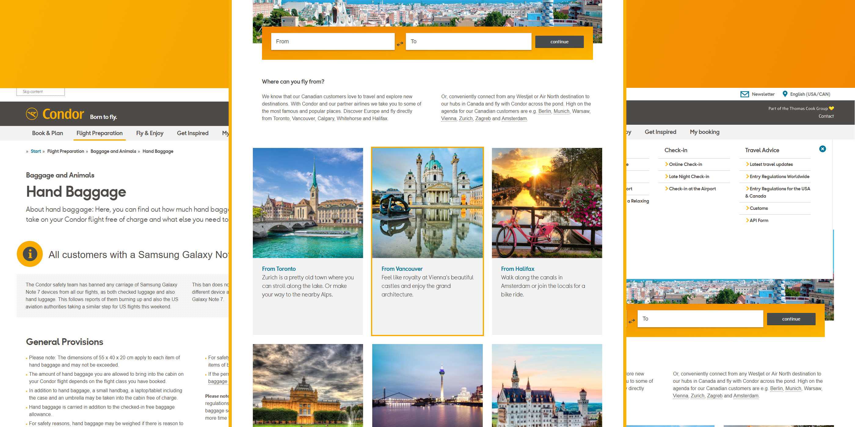
Extra elements helping to skip content, outlining focused elements, and buttons for closing layers. Skip links are only visible on focus.

HTML5 provides a big range of tags to describe the visual content better. We took care that we use the right tags, and added when necessary ARIA attributes
